Which RPG has the most jaw-dropping layout?
I don’t see half as many RPG books as I do character sheets – mostly because I’m more of a convention dilettante than a home group homie. So I’m going to twist this question to consider that instead. After all, character sheets are like eyes – they’re the window to the soul of a roleplaying game.
Too many traditional crunchy RPG character sheets are like a cross between a spreadsheet and what you might expect the Ministry of Public Works form 27B/6 to look like. As much as I love my spreadsheets and have a strong leaning towards public services, the less said about those kinds of character sheet, the better.
Instead, let’s stick with the theme of a mildly dystopian future and jump straight into Apocalypse World. The playbooks could be to roleplayers what Leuchtturm 1917 notebooks are to stationery geeks. They serve as a cross between a character journal, a setup guide and an in-game cheatsheet. All of those modes are in sync, and all are in harmony with the design goals of the game.
The tri-fold design and bold block print graphics emphasise a pick-up, play and pocket approach. They jab at you to get into the narrative action with the minimum of fuss wherever you are. Individually they are evocatively and functionally laid out. But it’s as a complete set that the playbooks together lay out the game, its scope and constraints for the whole group.
The layout concept and design was a jaw-dropping innovation in roleplaying games. Many games have since come along to be Powered by the Apocalypse. Each has its own take on the design principle of the playbooks. I’ve not seen them all, but many of them started to get complex and messy. The coherence of the original legal playbooks becomes lost. I think that’s partly because the final look and feel of the first edition AW suite were so grungy and dense that the layout template was obscured behind the tri-fold novelty. Oddly enough, the tri-fold setup – my favourite part of the playbooks – was dropped for the second edition.
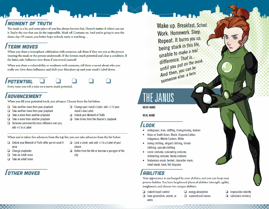
I have, however, been impressed with the Masks suite. These are bright (in more than just a genre-appropriate way), and clearly laid out with bold typography and dynamic graphics. The balance of whitespace makes the sheet very scannable. The highlights, contrasts and headings are well-considered and support excellent legibility. A useful consideration when you’re navigating them for the first time over maybe 2-4 hours in a session.
Each playbook has a character synopsis that looks like it’s rendered with some kind of slanty word-art treatment. Anywhere else it would be the design equivalent of using Comic Sans font or clipart in a Series A investor pitch deck. On these sheets though, it works beautifully to reinforce the tone of the game.
But there are a couple of other details though that make these playbooks stand out.
First is the widescreen landscape format – much like that beautifully designed book Hellas I flicked through once, when it’s opened flat. And a tad more useful than just turning an A4 or letter size sheet on its side. Most people play games sat along the long edges of tables. There’s precious little space to spread forward before you start encroaching on the gamespace of the person opposite. Or, more likely, the handouts, maps, battle sheets and communal rolling space that becomes occupied in the centre ground as the game progresses. With all that on the table, even the short edge with vast tracts of table ahead of them get compressed. Widescreen landscape format works so much better for narrow table depth, when you have your body width (including elbow room) to spread out along.
Second, well, it’s a layout, so obviously it’s better to be seen than left to my word-addled description. Download the playbooks and fire it up in your PDF viewer. Maximise the window and switch to the 2-page view. Scroll through each double page spread. Notice how the character synopsis and graphic is just to the left of centre. On every page. Kapow! It hits you, in the centre forcing itself to be your focal point. And on every page. As you scan out, everything else is all so consistently laid out. Regardless of the playbook you’re using and the differences between them, everything that logically fits together is in broadly the same place.
- Setup and advancement in the leftmost column.
- Character headline concepts next (what you look like, and your core ability).
- Followed by general mechanical aspects.
- And finally the unique playbook moves.
It’s the same for each. The peripheral stuff is on the periphery. The core stuff is in the central columns. That consistency makes them so easy to navigate as a player, and for the GM to direct newcomers to the game. There should be no more “where’s my [insert important stat]?” to slow down crunchy combat.
And as you dive into the pool of playbooks presented to you at the start of a con session, you very quickly see what the differences are between them. It’s much more straightforward to assess how mechanically and narratively complex a character might be to play before you commit, such as the Protégé who has a mentor and the Legacy who has, erm, a legacy.
So Masks: A New Generation has taken a really neat idea (the Apocalypse World playbooks) and turned them into a very slick and usable playing tool. They’re also not perfect but the concept and execution set a new bar for jaw-dropping production.


